The high-end fashion world has been trying to embrace smartwatches for years. But apart from Fossil, luxury houses (and most tech companies) have given up on Google’s Wear OS. Gone are the Movado Connect smart watch, the LG watch style and the Moto 360. In their place sit a slew of smartwatches made by Fossil, that are basically the same device in various styles. It’s not surprising, then, that for its third effort at a connected timepiece, Louis Vuitton is leaving Google’s OS behind and using its own proprietary software instead.
Like previous generations, the LV Tambour Horizon Light Up starts at about $3,400 and features a loud design that’s definitely not for everyone. But given the recent launch of WearOS 3, which promises to be more useful and responsive, I was curious to see if LV’s own platform might be good enough for a device that costs thousands of dollars.
But first, the hardware. Because anyone considering dropping $3,500 on the Tambour Horizon Light Up is probably more interested in how this thing looks and feels.
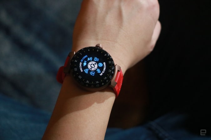
Frankly, I’m surprised by how much I didn’t hate the design. Sure, the ostentatious markings all around the 1.2-inch screen could be considered gaudy. [Ed. note: Cher, what?! – Dana] But the watch faces themselves were bold and colorful in a way that I found amusing at first but soon grew to appreciate. Each time I saw a new face, or when the 24 LEDs in the monogram ring surrounding the screen lit up in RGB colors, I gleefully sent pictures to my coworkers, intending to revel in shared mockery. But most of us agreed that not only did the faces not suck, we actually kind of liked them. (Except Dana, who wrote this parenthetical.)
Gallery: Louis Vuitton Tambour Horizon Light Up smartwatch | 10 photos
Gallery: Louis Vuitton Tambour Horizon Light Up smartwatch | 10 photos
Two criticisms kept coming up, though. The orange rubber strap that LV sent was not only too large for my wrist, causing the watch to keep slipping around, it also looked cheap. I’d have preferred the white or black options instead, as they appear more understated and seem to pair better with the bold graphics on the case. I also received the Matte Brown design case, which starts at $4,110, instead of the base model.
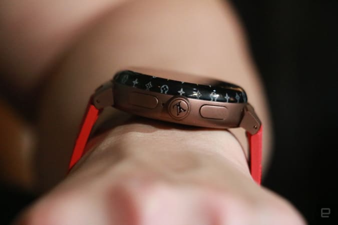
That’s the other thing most people noticed when they saw the watch, by the way. The 44mm case is not only thicker than most smartwatches at 13.2mm (0.5 inches), but it’s also very dense.
Though its face features curved sapphire glass that helps it look smaller than other smartwatches this size, its heft and weight ultimately make wearing the Tambour Horizon Light Up feel like strapping a puck onto your wrist.
If bulky timepieces don’t bother you, you might appreciate what Louis Vuitton has to offer here. The company calls this the “most customizable connected watch in the world,” offering a slew of exclusive watch faces that really pop on the 390 x 390 AMOLED screen. There are eight dial configurations to choose from and when you set up the watch you can also input your initials, which will show up on some designs.
Cherlynn Low / Engadget
Rotating the watch’s dial on the right switches to different themes, while pressing the top button on the edge cycles through various color schemes. The fact that LV decided to dedicate the dial and button to these functions shows that the changing up the Tambour Horizon’s appearance is its main priority. You can use the companion app to customize the remaining button at the bottom to pull up apps like Alarm, Timer, Stopwatch, Heart Rate, Steps and Camera remote. But more on that in a bit.
One new feature on this generation of the Tambour Horizon is its Always On Display, which also changes based on the theme you’ve selected for your home screen. And depending on the style you choose, the LEDs beneath the monogram ring on the bezel will light up in corresponding colors. This might be my favorite part of the device. The lights also flash when you get an alert and it’s truly delightful to watch.
You can choose which apps can send notifications to your wrist, through the Louis Vuitton Connect app on iOS or Android. This is also where you’ll get clearer explanations for some of the watch’s functions, like its “modes” and shortcuts. All told, the Tambour Horizon offers four profiles: Blossom, which displays all the available animations at maximum intensity, Explorer, which balances animations and performance with battery life, Submarine, which silences notifications and dims the lights, and Saver, which turn off all but the most essential functions to conserve power.
Cherlynn Low / Engadget
You can activate these by swiping up on the watch to view the Control Center, and then tapping the Mode button in the middle. The Control Center also offers options to dig into settings, find your phone, start a timer or launch your phone’s camera, along with information about the watch’s battery levels and connectivity.
The rest of Louis Vuitton’s OS is straightforward, if a little rudimentary. Swipe down to see your notifications, and swipe right to go through the available widgets. The left of the home screen houses about five “apps” as part of a so-called “My Day” section, showing your calendar, heart rate, steps count and the weather and air quality in your area. You can reorder these and choose which permissions to allow. This part of the OS feels a little like Tizen (or Wear OS’ Tiles), with its side-swiping navigation.
To the right of the home screen is a page for your upcoming travel, and you can use the app to enter flights, hotels or trips or send your booking confirmation to a customized email address. Your upcoming trips will then show up on the watch, and scrolling vertically through the panels will pull up a QR code for your boarding pass, information about your terminal, gate and seat, as well as the relevant time zones.
You can also swipe sideways to see LV’s travel guides for your destination, and when I tapped here for a pretend trip to Singapore, the watch showed me more information on the local Botanic Gardens. It also offered shortcuts for calling the park and mapping directions there.
Cherlynn Low / Engadget
This focus on travel is a feature unique to LV’s OS, but it’s not difficult to replicate on Apple’s watchOS or even Wear OS. For the most part, you can either use Apple Wallet or the Google Assistant to find similar ticket-related data or install a third party app. But the integration here is more seamless and requires fewer steps. I also like the way LV presents the data in an easy-to-read format, and the graphics and icons here are cute, if hard to understand at first.
Because I connected the Tambour Horizon to my iPhone, I’m not able to reply to messages from my wrist. But basically everything else about the watch’s OS feels functional, if a bit limited. It doesn’t offer constant heart-rate monitoring, sleep or fitness tracking or third-party apps, for example. It’s worth noting that most modern smartwatches do that, so if you’re willing to overlook the lack of features for the price, you’re probably a hardcore LV fan.
Perhaps because it’s doing less in the background, the watch generally lasted about a day and a half of average use. Despite packing the latest Snapdragon Wear 4100 processor, though, the Tambour Horizon occasionally felt laggy, something I’ll chalk up to possible inefficiencies in the software (rather than a problem with the chip).
Was it ever slow enough to frustrate me? No. Are LV’s travel and customization-minded features enough to outshine Wear OS? Also no. But in leaving Google’s platform behind, LV has been able to deliver a unique and surprisingly satisfying experience, albeit in a chunky device that might not appeal to all. Especially not for upwards of $3,000. But with the Tambour Horizon Light Up, LV has demonstrated that it’s possible to build a workable smartwatch without Google’s help.
All products recommended by Engadget are selected by our editorial team, independent of our parent company. Some of our stories include affiliate links. If you buy something through one of these links, we may earn an affiliate commission.


