Imagine this. You come into work, load up your dashboard, and you’ve got a map of the world – each country a different colour. The greener the country, the more your game is making there.
Visualizing your data can help you understand how your games are performing on an instinctive level. Numbers don’t often ‘click’ in our minds. But visuals – those give us good feelings. They can help you see your data from a different perspective, and let you spot important insights you would have otherwise glossed over.
But what can you do? Let’s dive into the top data visualization techniques and how to use them.
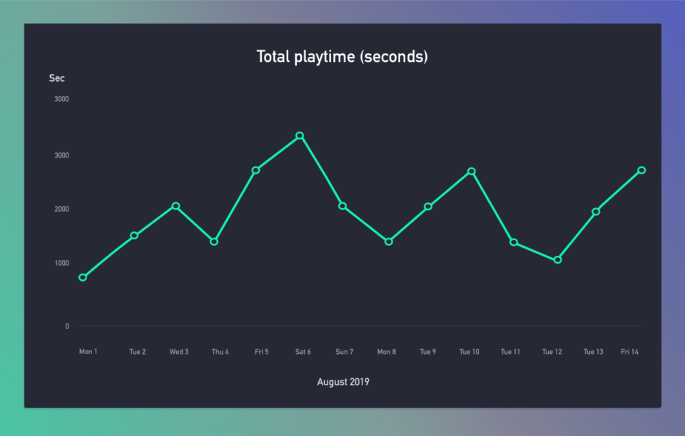
1. Line charts: Think time
Line charts show us how values change over time. They’ll let you spot trends, like whether you have a lull in your installs on the weekends. Need to see how many sessions you’re getting day by day? line chart. Want to know how much revenue you’re making month by month? line chart.
2. Bar charts: Best for quantities
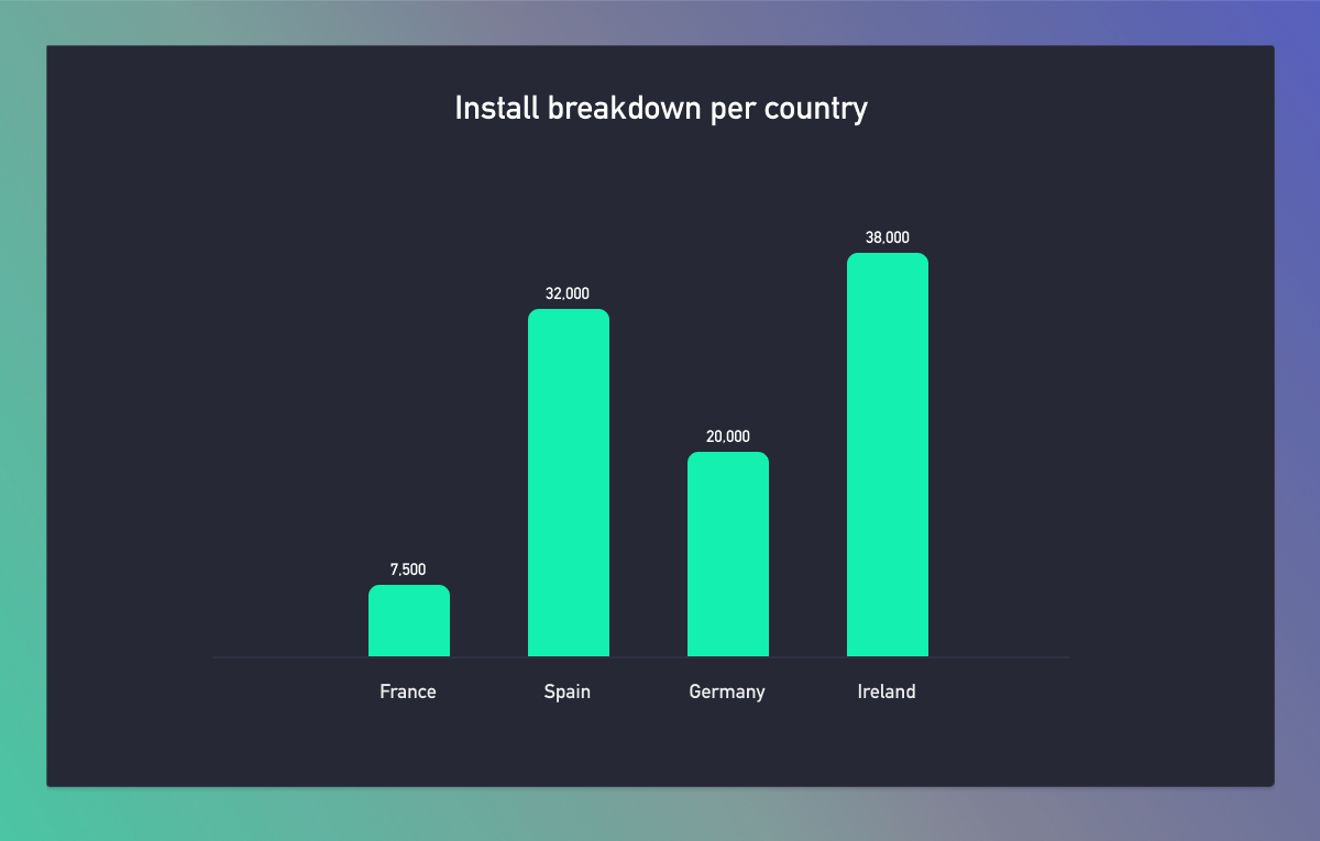
These are one of the most common ways to show your data. You’d typically use bar charts to compare two pieces of data and answer questions like “how many installs did my game get in each country” or “how many players did I get from each campaign?”
Where line charts are good for time, quantities are where bar charts shine.
2.1. Stacked bar charts: for comparing quantities
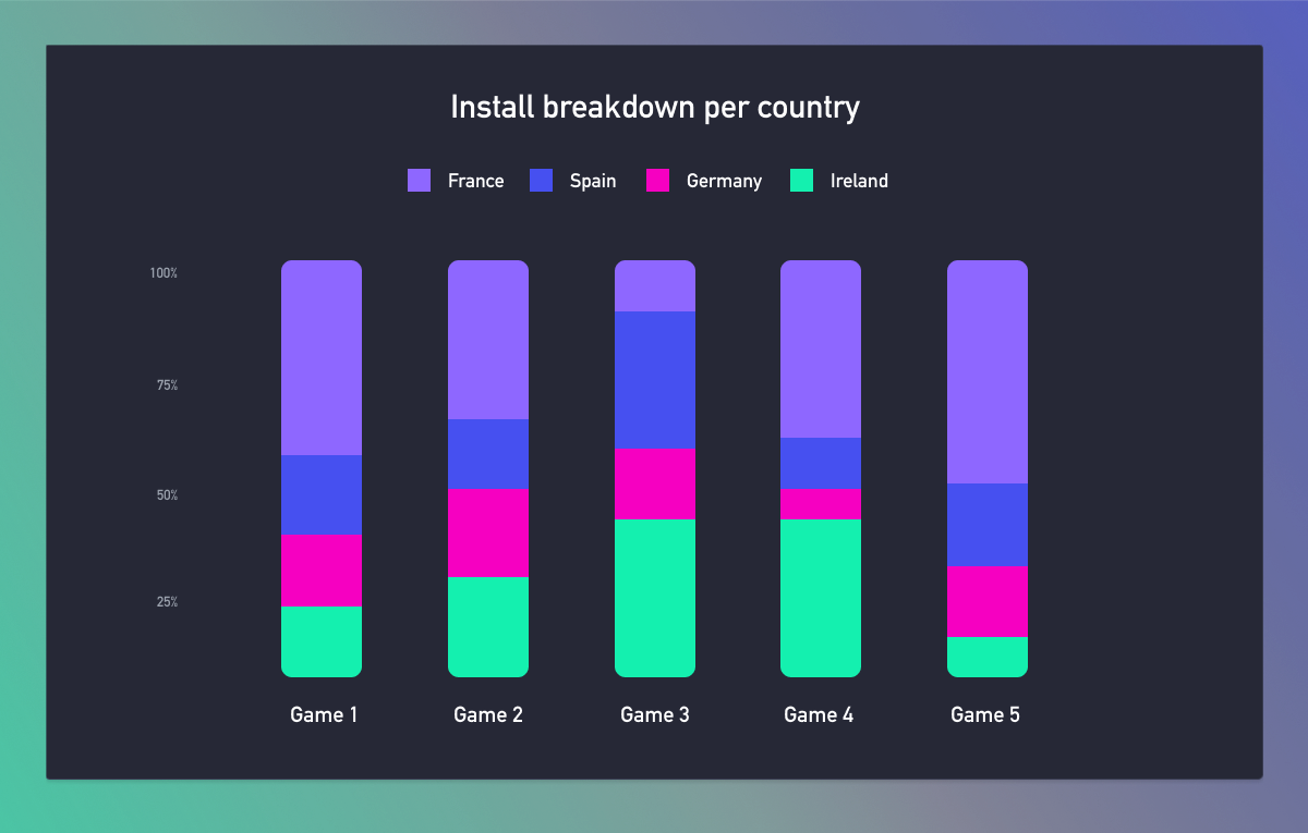
Stacked bar charts are basically combining a few bar charts into one. So rather than showing one game, you could stack in more from your portfolio. This can help you compare your titles and data to spot trends.
Take the above example. France is a good source of installs across the board, except for one game. You know that overall, players from France like your ads and install your games. So maybe you can work on the creatives for that underperforming game. Or maybe localizing that title some more.
3. Pie charts: Great for showing percentages
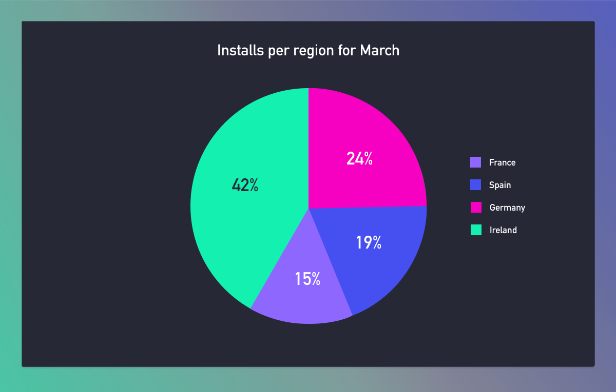
Use these when you need to see percentages. Say you want to see which campaigns made you the most money in April. Use a pie chart. Or perhaps your investors want to see your audience breakdown. Use a pie chart. They’re easy, simple, and gets the point across quickly.
That said, although they’re best for a quick glance, often a bar chart will work better. (Those are generally easier to read.)
4. Funnel chart: Perfect for progression
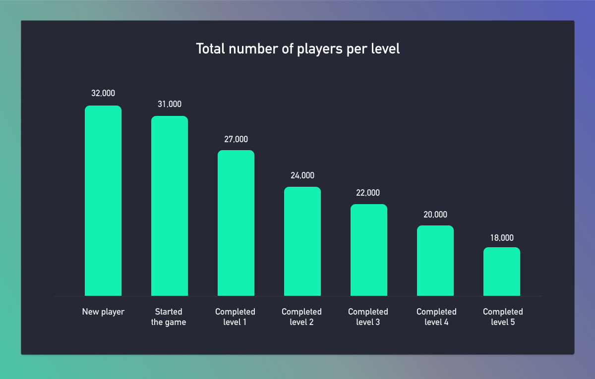
Funnel charts may look like a bar chart to begin with, but you’ll notice that each step gets shorter and shorter. That’s because it’s showing progress.
In the example above, we’re seeing what percentage of players completed each level. See there’s a large drop off at level five? That means we now know something is wrong with this level. The only thing is we don’t know why. That’s when your analysts come in and start doing some research – most likely with your raw data.
5. Scatter plots: Best for spotting correlations
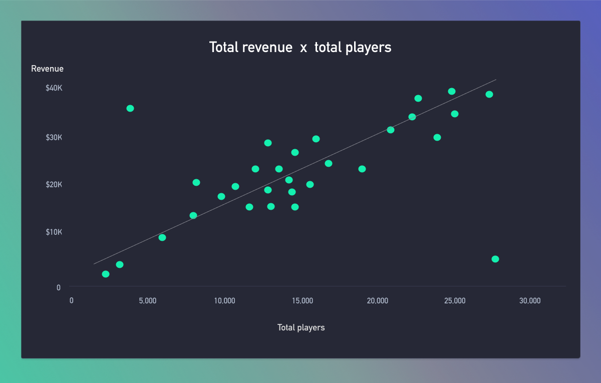
Scatter graphs can help us find relationships between two variables. Take the above example. Each dot represents a game, the number of players is on the x-axis and how much revenue that game made is on the y-axis.
Usually, the more players a game has, the more money it makes. But with this graph, we can easily spot any outliers. Take the game at the top left – this title doesn’t have a lot of players, but brings in a lot of revenue. It’s safe to assume that this is a profitable game, and we can ramp up our UA campaigns for it. (In real life, you’d hover over the dot to get the game’s name.)
Now look at the game bottom right. It has lots of players but little revenue. In this case, you could show those players ads for your other games to reduce UA costs and keep them in our ecosystem.
6. Treemaps: Great for large datasets
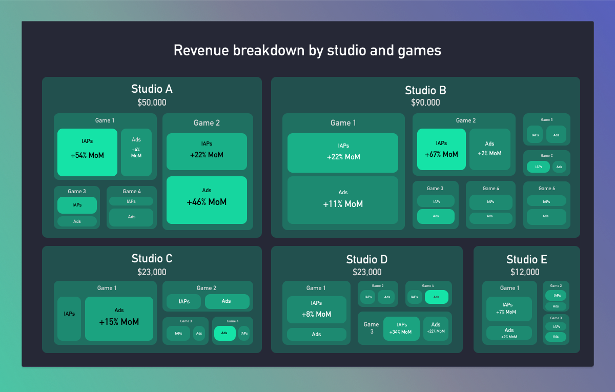
Rectangles within rectangles. That’s a tree map. Each rectangle is a different group. And each group can have subgroups. The size of the rectangle represents its value. And they’re great when working with large sets of data. The key thing to remember it’s always the same metric you’re measuring, no matter how deep you go – whether that’s downloads, revenue or playtime. It’s similar to a pie chart, each section in the treemap shows a percentage and makes it easy to compare the sections at a glance. And it’s worth remembering that certain metrics, which are particularly variable, won’t work here.
In the diagram, we’ve used a treemap to show how much each game and studio makes, and where that money comes from. So Studio A brought in $50,000. The most profitable game was Game 2, and it made more from its Ads than IAPs.
Use labels and colors to show more info. The lighter shade of green shows the profit increased month-on-month. And the label shows the exact percentage.
7. Heatmap table: Perfect when working with numbers
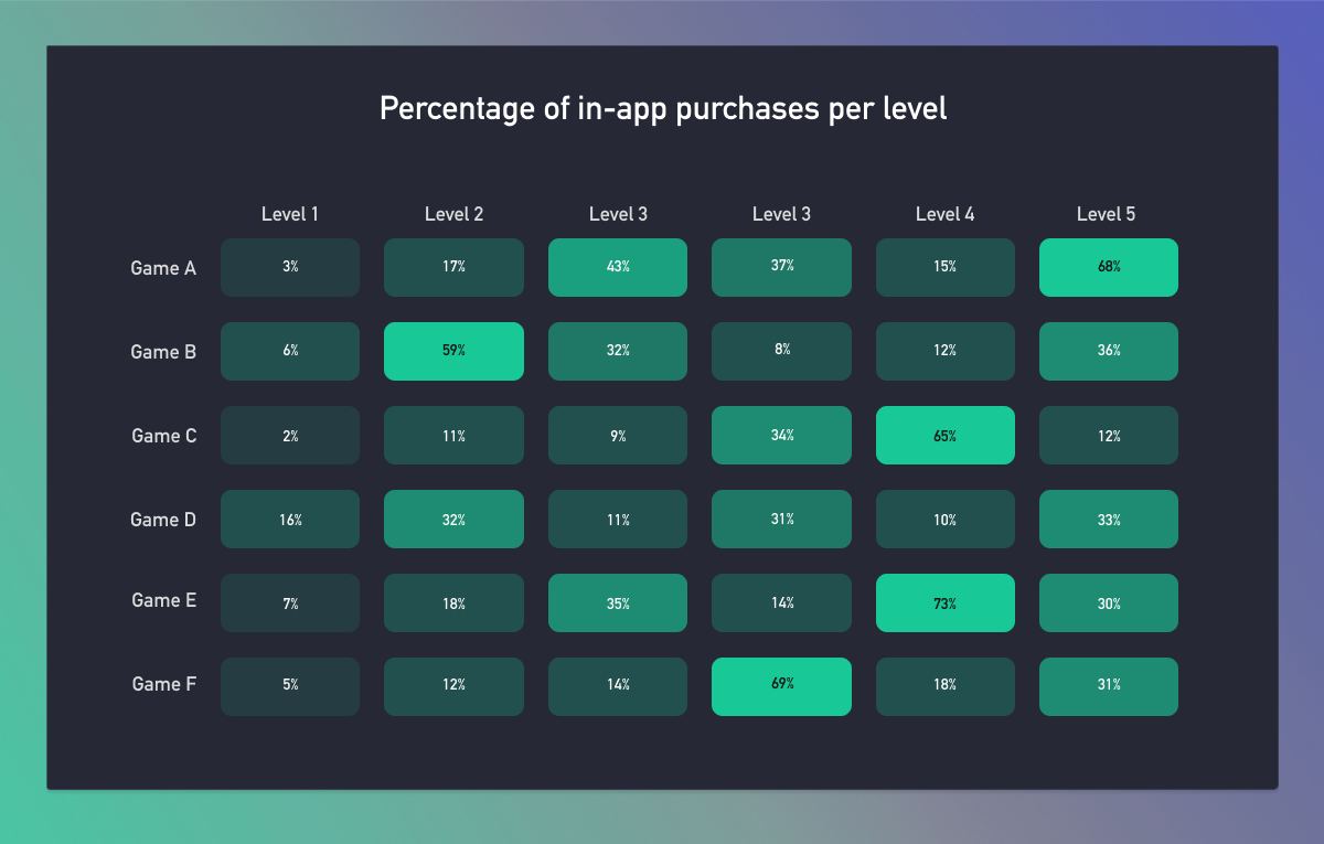
People aren’t very good at processing numbers. We’re much better with colour. So heatmaps are great if you have a lot of specific results, but just care about whether they’re good, neutral or bad.
For example, you might have a table of each level in all your games, and how many players reached that level. You don’t actually care about the exact number, you just want the cell to be green if it’s high, red if it’s low. That’ll help you spot any issues at a glance. (In the graph above, we’ve used gradients of green. The brighter the better.)
8. Infoscapes: Discover relationships
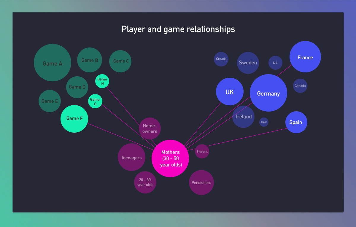
Infoscapes. Mind maps. Network diagrams. There are quite a few ways to describe a graph like this. But whatever you call it, they’re about showing the relationship between different objects.
These are usually quite interactive, as the amount of data can make the graph seem overwhelming at first. The real power comes from being able to click an individual node and see the connections to that one specifically. (If you want to see how it works, we recommend playing Democracy 4 – where the entire game loop is about playing around with a graph like this.)
For example, you might want to know the relationship between different demographics, regions, and games. Now, you might have a node called ‘homeowners’. This node has lines connecting it to three of your games, as well as Germany, the United Kingdom, China, and the United States. This can tell you a lot about what that demographic enjoys, where they mostly live, and even how much they’re making you.
9. Calendar heatmap: Helps you plan
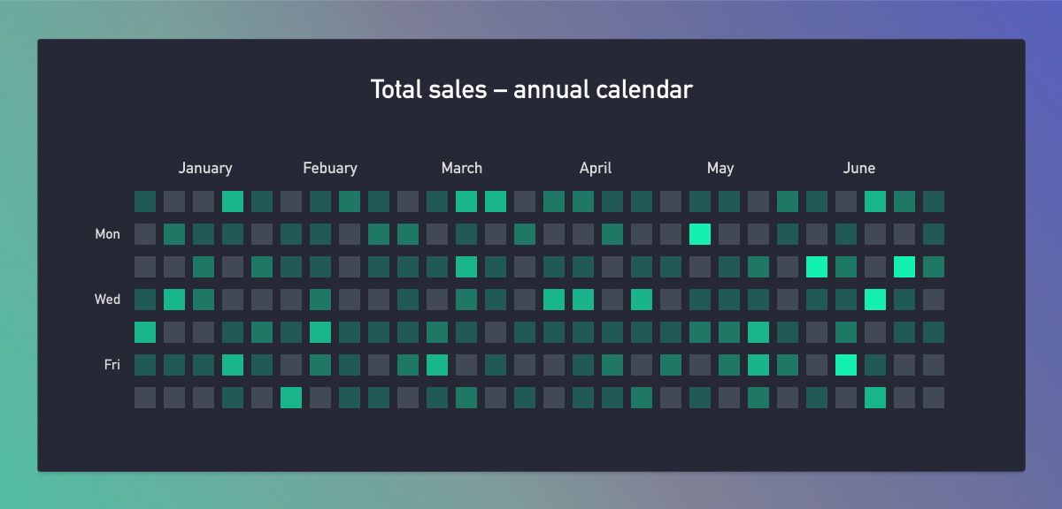
Pretty much the same as the heatmap table, but this chart shows a heatmap for the calendar year. Great for when you want to figure out your most profitable days or weeks. This data can help you plan your campaigns, launch dates, user acquisition strategy, and more.
For example, you could use this heatmap to monitor which days had the most sales throughout the year. You could plan your promotions around these days to increase sales even more.
If you use a data warehouse, you could even split your calendar heatmaps by player segments, and focus purely on your most valuable customers. And if you’re really clever, you could pump this data into your processes and automations, which you’d use to test and roll out new iterations of your game.
10. Data maps: Useful when comparing countries
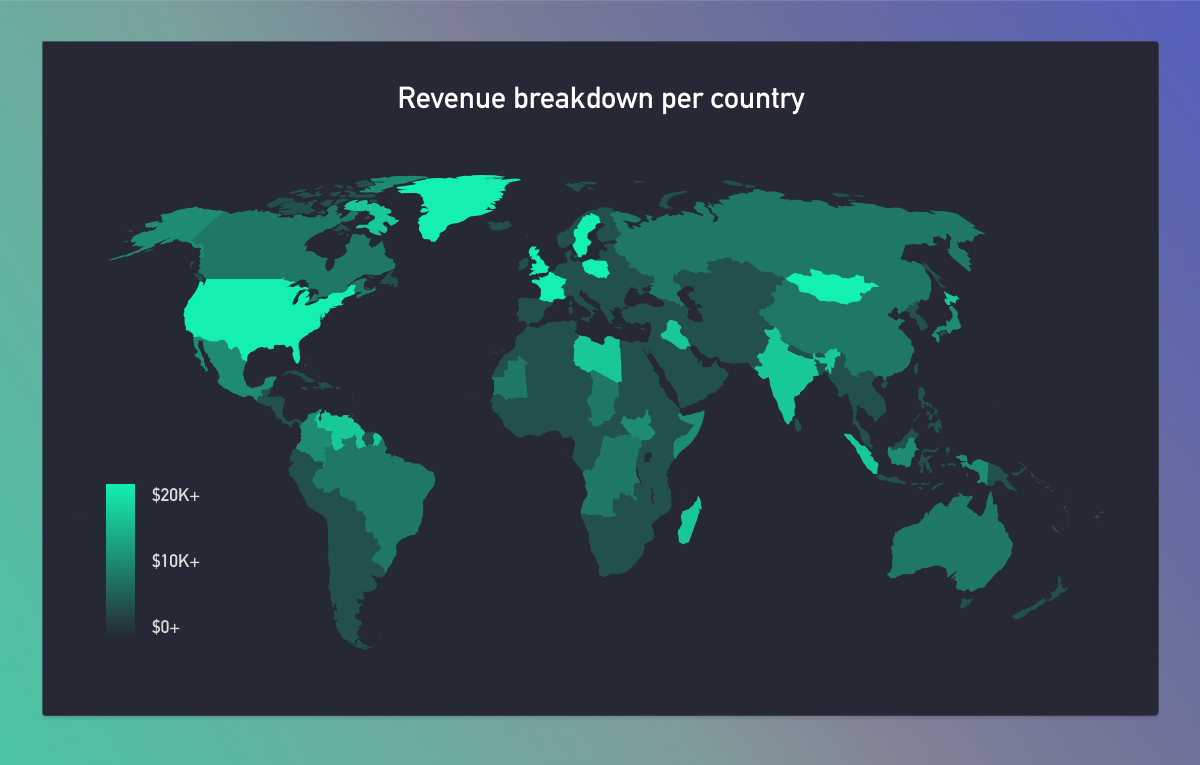
A data map shows you insights about different countries and regions for your games. You can quickly see which locations for a specific metric or game is performing best. These graphs are useful to have on your overview dashboards and reports.
You could use this map to see how your user acquisition campaigns perform across different regions. You could even tie in your player’s LTV and learn which locations bring you the most high-value players, if you wanted to turn it up a notch.
11. Radar graphs: Handy for comparing your games
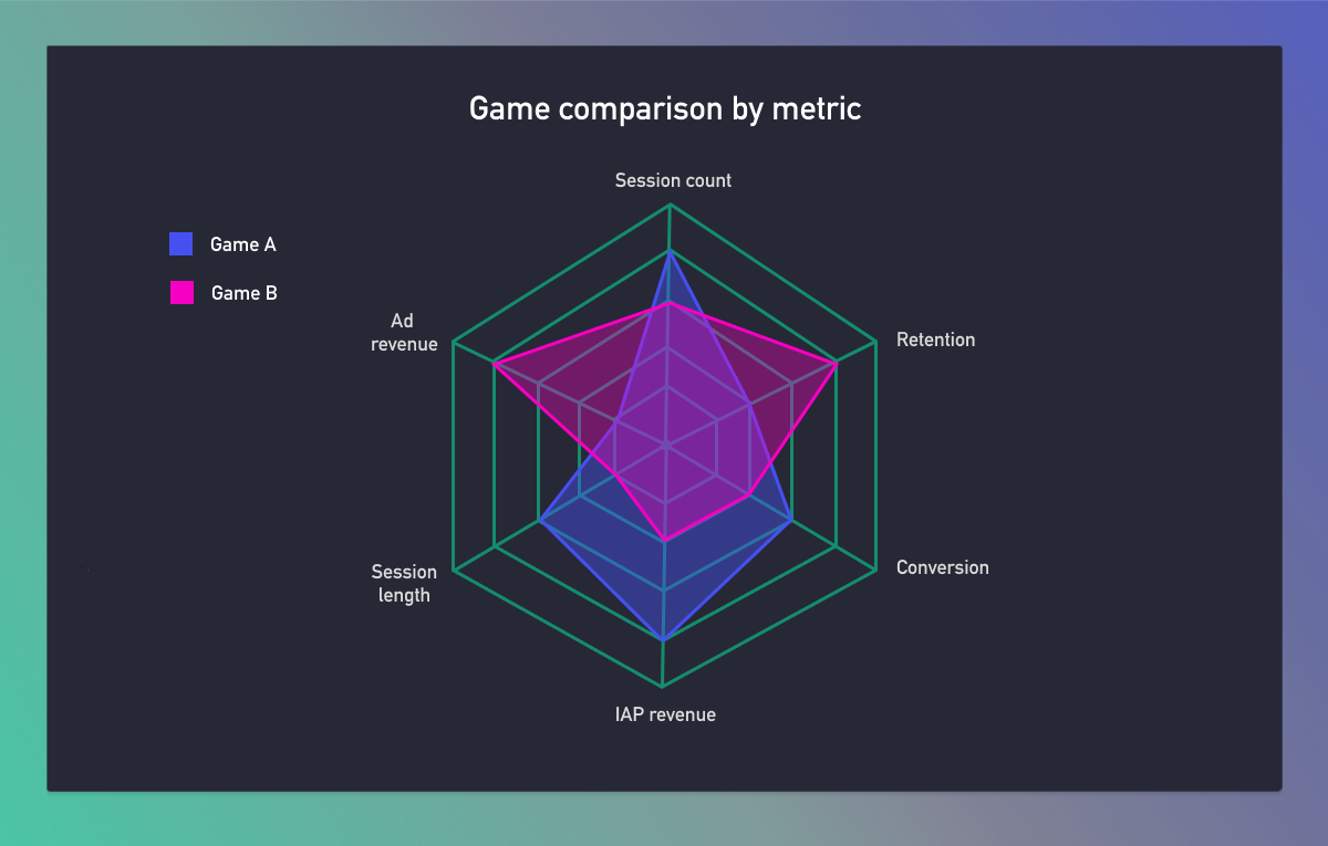
Also known as web charts, spider charts, and star plots. You’d use radar charts to compare multiple games against multiple variables at the same time (usually with ratings from one through to ten).
In the graph above, we’re comparing two games on different metrics, like retention, engagement, session length, revenue, and more. You can quickly spot which game is doing best. But the downside with radar graphs is that you can only show a few categories at a time. Any more, and they’re tricky to read.
12. Sankey diagram: Great for tracking your players’ journeys
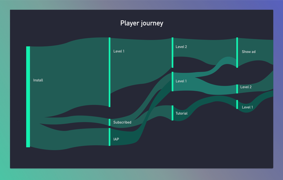
These are all about flows of data. Sankey diagrams are similar to funnels, except they are much more in-depth. They can show what journey a player took to reach a particular action or event (as well as how many players took that route, too). You could track your most valuable player’s journey from install to first spend or single out a specific player if they did something unique if you wanted.
From the graph above, we can see that most players who install the game, immediately start playing the first level. And most people seem to skip the tutorial, unless they subscribed first. This might show you that your tutorial is hidden away for normal users and that you need to fix something in your game.
For Sankey diagrams, you’ll need a data warehouse and access to your event-level data.
Build the reports you want
Now you’re up to speed with some different visualization techniques, go ahead and give them a whirl. If you’re not equipped to get started, you can access your raw data and a data warehouse with DataSuite. Get in touch with our team who can answer any questions and help you on your way.
